Viva, one of Mexico’s leading airlines, recently updated its visual identity and needed to bring this evolution to its digital ecosystem. The challenge was to redesign the entire website in line with the new brand style, ensuring every interaction conveyed clarity, trust, and ease of use.
Key design artifacts included:
Design System and scalable components, documented in Figma.
Mid-fidelity wireframes and interactive prototypes, tested with users to validate information hierarchy and visual clarity.
User flows centered on booking, payment, and trip management.
A/B testing and Nielsen heuristic evaluations to ensure readability, consistency, and friction reduction.
User persona:
One of the key personas we identified was Mariana. She’s 32, lives in Mexico City, and works as a marketing manager. She travels several times a year — sometimes for work, sometimes for leisure — and usually books everything online.
For Mariana, price matters, but so does flexibility. She wants to be able to add luggage, choose her seat, or even change her flight if something in her schedule shifts. What often frustrates her is when websites make payments confusing or don’t clearly show what’s pending and what’s already confirmed. Another pain point she mentioned is the amount of steps she has to go through just to finish a booking — too many forms, too many clicks.
She’s not super techy, but she’s comfortable using both her laptop at work and her phone when she’s on the go. For her, the ideal experience is simple, transparent, and consistent across devices. She wants clear calls to action, no hidden surprises in the process, and the confidence that if she needs to manage her trip later, it won’t be a headache.
Designing with Mariana in mind helped us focus on clarity, transparency, and modularity — things like showing balances up front, breaking down add-ons into manageable steps, and making sure the same design system worked seamlessly across desktop and mobile.
Solutions
Interaction:
The redesign simplifies how users interact with the platform, providing clearer booking flows, easy navigation, and transparent CTAs that reduce friction in the purchase journey.
Clarity in Payments:
Users can see pending balances, deadlines, and installment options upfront, minimizing confusion and building trust during the payment process.
Mobile-first Experience:
The new design system ensures consistency across desktop and mobile, allowing travelers to manage reservations, add services, and book flights seamlessly from any device.
Promotion & Add-ons:
Extra services such as luggage, seat selection, or insurance are offered contextually during the booking flow, making upselling simpler and less intrusive.
Automation with Components:
By building a scalable component library, the platform ensures faster updates and consistency in new features, adapting quickly to seasonal campaigns or fare promotions.
Increase in Conversions:
With improved usability and transparency, the platform enhances user trust and decision-making, leading to higher booking completion rates and customer satisfaction.
Design System & Component Governance
A modular approach to building Viva’s digital ecosystem, where each interface element is designed as a scalable component. This methodology, based on atomic design principles, ensures consistency, order, and efficiency, allowing teams to manage updates and new features with clarity and control.
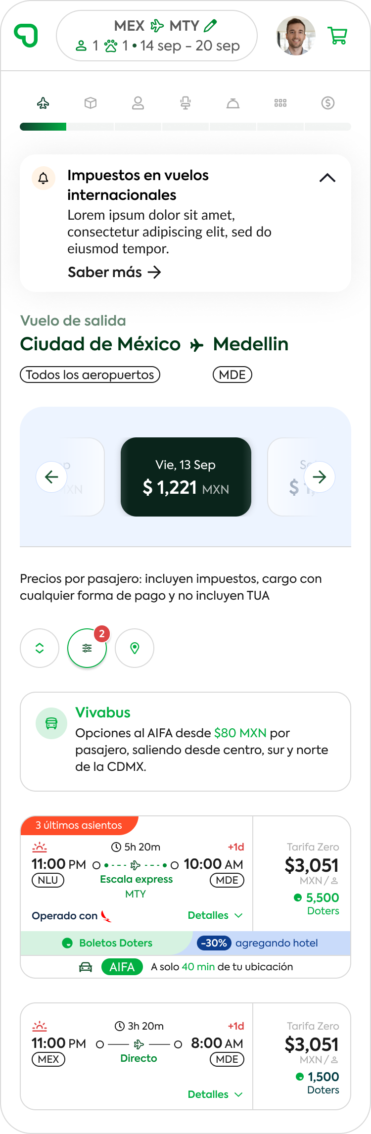
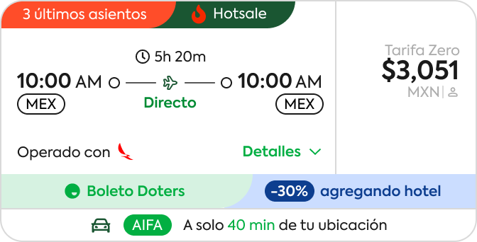
The new flight card
A fully functional flight card with dynamic elements such as discounts, Doters points, and urgency messages.
UX: balanced clarity and promotion, ensuring the itinerary remained easy to understand.
UI: micro-interactions and color hierarchy highlight availability, price, and benefits.
Artifacts:contrast and accessibility tests to guarantee legibility in high-information scenarios.
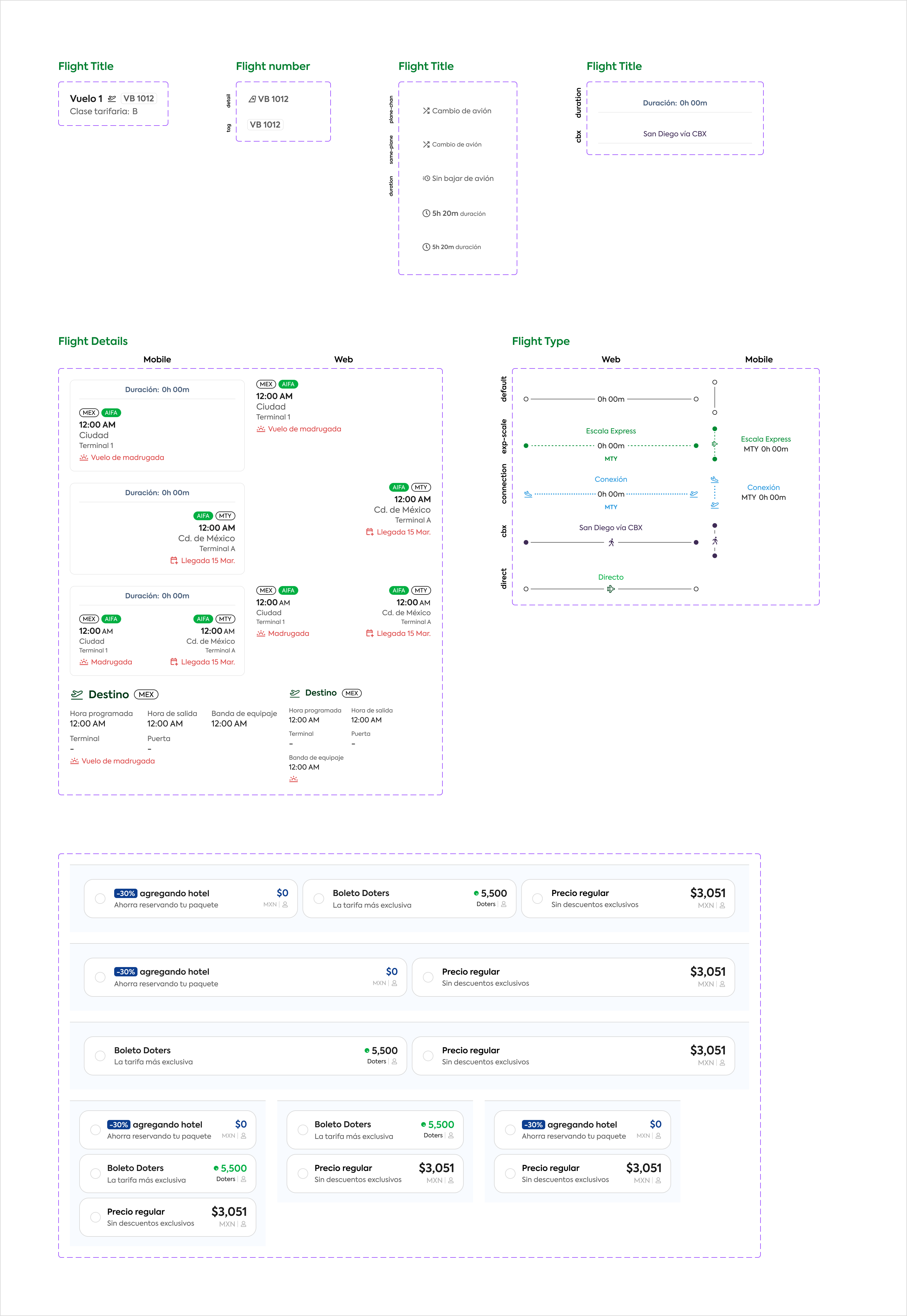
Flight Card Configuration (Control Panel)
An internal interface for enabling/disabling sections of the flight card (e.g., promotions, location, hot sale).
UX: provides flexibility for internal teams to adapt cards based on campaigns or seasonality.
UI: switches and dropdowns simplify customization.
Artifacts:admin flows designed to improve operational efficiency.
Modular Components
This image showcases the molecular approach applied to Viva’s design system. Each flight card element—titles, numbers, details, and prices—was designed as independent molecules that can be combined to form more complex structures.
The methodology ensures:
Order: every element follows consistent spacing, typography, and color rules, making the UI predictable and easy to scale.
Governance: centralized documentation in Figma allows teams to activate, deactivate, or update modules without breaking consistency across platforms.
Efficiency: by reusing these molecules, development and design cycles are accelerated, reducing redundancy and errors.
This structured approach provides a strong foundation for scalability, ensuring that future updates—whether for promotions, new payment methods, or different flight types—can be integrated seamlessly into the ecosystem.
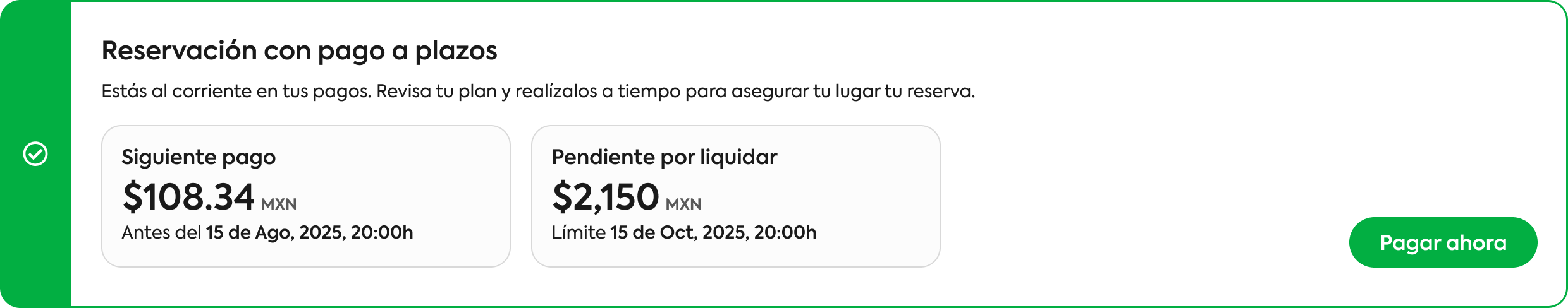
Installment Payment Component
Designed to display and manage split payments for a reservation.
UX: clarity on upcoming payments, amounts, and deadlines.
UI: differentiated blocks with color states (green = on track, orange = upcoming).
Artifacts: validation sessions with users to minimize friction in understanding financial status.
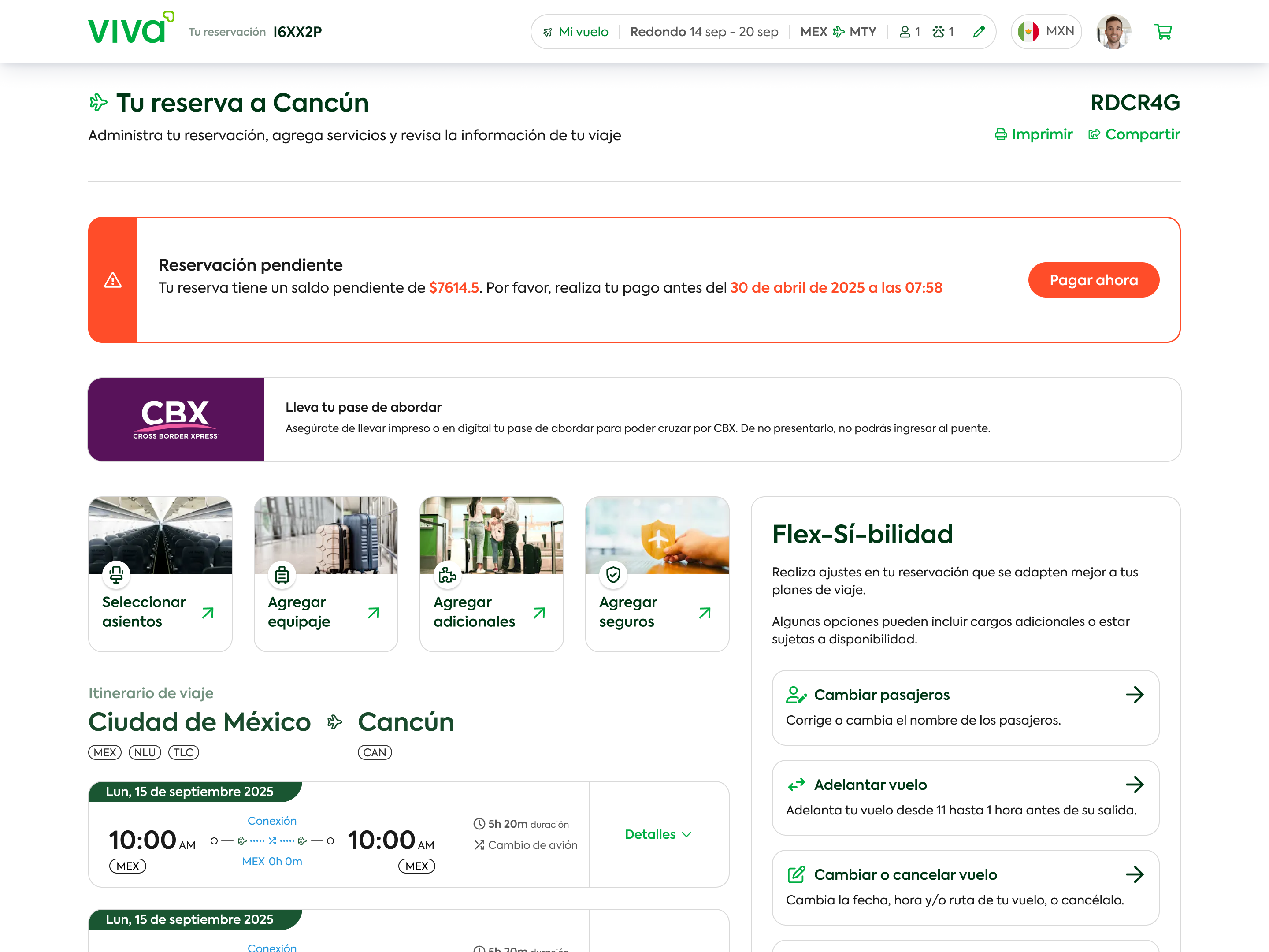
Booking & Trip Management Screen
The “My Reservation” view shows clear information about payment status, itinerary, and add-on services.
UX decisions: simplified critical messages (pending balance, deadline, main CTA).
UI: applied Viva’s new brand palette and typography, highlighting urgency with red alerts and green CTAs.
Artifacts: content prioritization tests and layout explorations in wireframes.
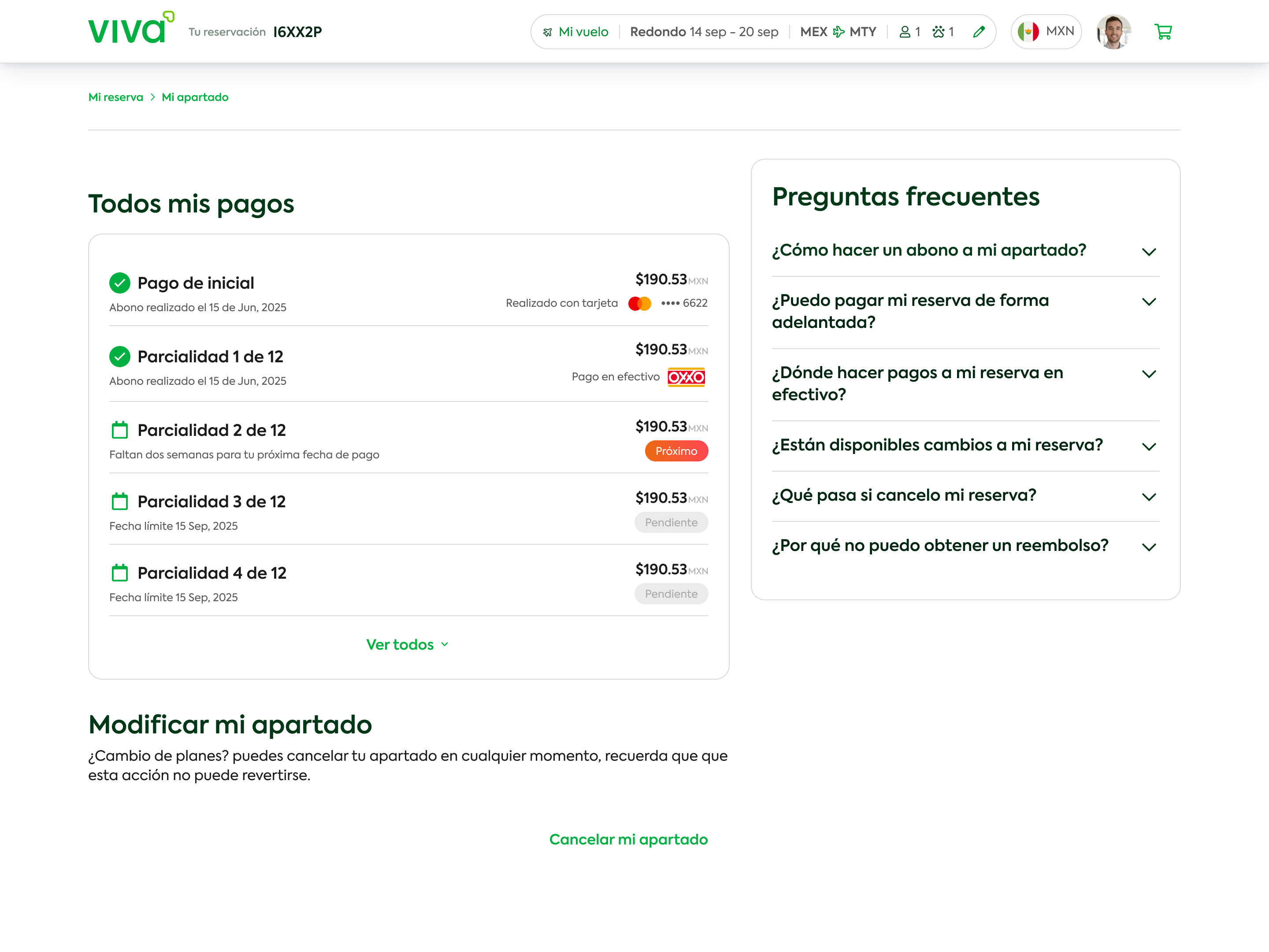
Payment History Screen
A transparent breakdown of all installments completed or pending. The linear structure and checklist visuals were crafted to build trust and reduce uncertainty in financial interactions.
UX: linear structure provides transparency and reassurance for financial transactions.
UI: checklist visuals (green/pending) deliver instant status recognition.
Artifacts:interactive prototypes tested for icon clarity and state hierarchy.