AR/VR

Platform for Global Data Analysis

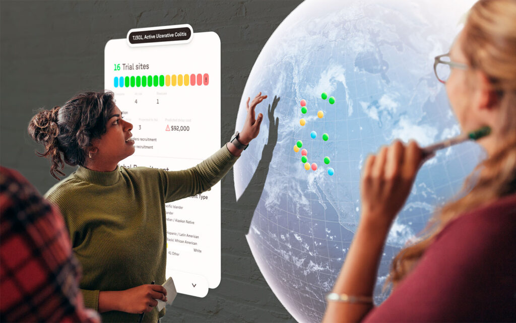
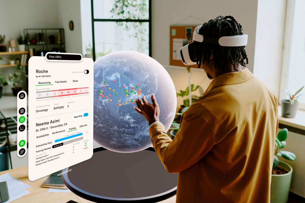
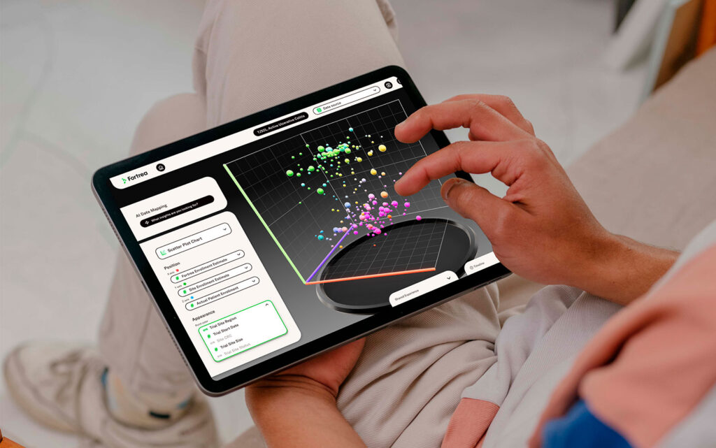
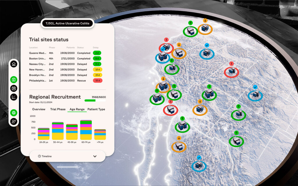
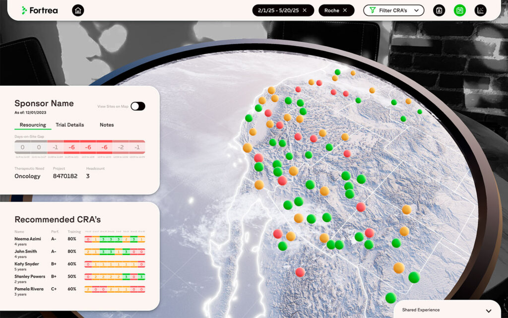
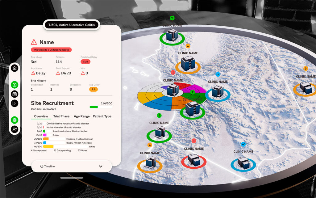
Fortrea is a company focused on clinical research. The challenge was to design a multi-device platform (AR, VR, and tablet) that would allow internal teams to visualize global data in real time, along with key business KPIs: resource availability, clinical trial status, staff allocation, and delay predictions.

The main goal was to transform complex data into immersive, intuitive, and collaborative experiences that supported strategic decision-making for managers and stakeholders.

Key design artifacts included:

  • Empathy maps and user journeys to understand the needs of managers and analysts.

  • Low-fidelity wireframes and interactive prototypes in Figma to validate information flow before moving into AR/VR.

  • Usability testing in immersive scenarios, evaluating accessibility, readability, and consistency.

  • Design tokens and 3D interaction guidelines, ensuring a cohesive experience across all devices.

Key Features and Functionalities

AR Interaction with Globe and Control Panel

Users can explore a 3D globe in augmented reality while accessing a side panel with critical project and resource metrics.

  • A hierarchical information architecture prioritized staff availability, trial details, and operational gaps.

  • The panel design was simplified to avoid overloading the immersive experience.

Global CRA Resource Overview

A 3D globe displays the geographical distribution of resources, represented through color-coded nodes.

  • Designed as a simplified heat map, enabling managers to quickly identify critical areas.

  • Supports proactive risk detection in operations planning.

3D Recruitment Chart

A 3D scatter plot allows analysis of correlations between enrollment estimates and actual patient recruitment.

  • Users can freely configure axes and filters, ensuring analytical flexibility in VR.

  • Motion guidelines were developed to create smooth interactions and reduce cognitive load.

Global CRA Resource Overview

A 3D globe displays the geographical distribution of resources, represented through color-coded nodes.

  • Designed as a simplified heat map, enabling managers to quickly identify critical areas.

  • Supports proactive risk detection in operations planning.

CRA Recommendation Panel

The interface highlights recommended CRA’s based on performance, training, and availability.

  • Comparative tables with color coding make decision-making transparent and efficient.

  • Helps managers assign resources with greater accuracy and justification.

Site-Specific Panel

Detailed view of an individual trial site, showing predicted delays, historical performance, and patient composition.

  • Applied progressive disclosure: critical alerts are shown up front, secondary data in tabs below.

  • Readability of metrics was validated in 3D vs. 2D environments, ensuring clarity in immersive contexts.

Feel free to reach out!

Let’s create something great together.